

Foro
16 posts
PERFECT FOR donshottype!

I know don likes these challenges, so i decided to give him one. Been searching for this font for a while now. Whoever finds it gets a PayPal treat!
Sterling Script Sugerido por donshottype
Fuente sugerida
Sterling Script Sugerido por donshottype
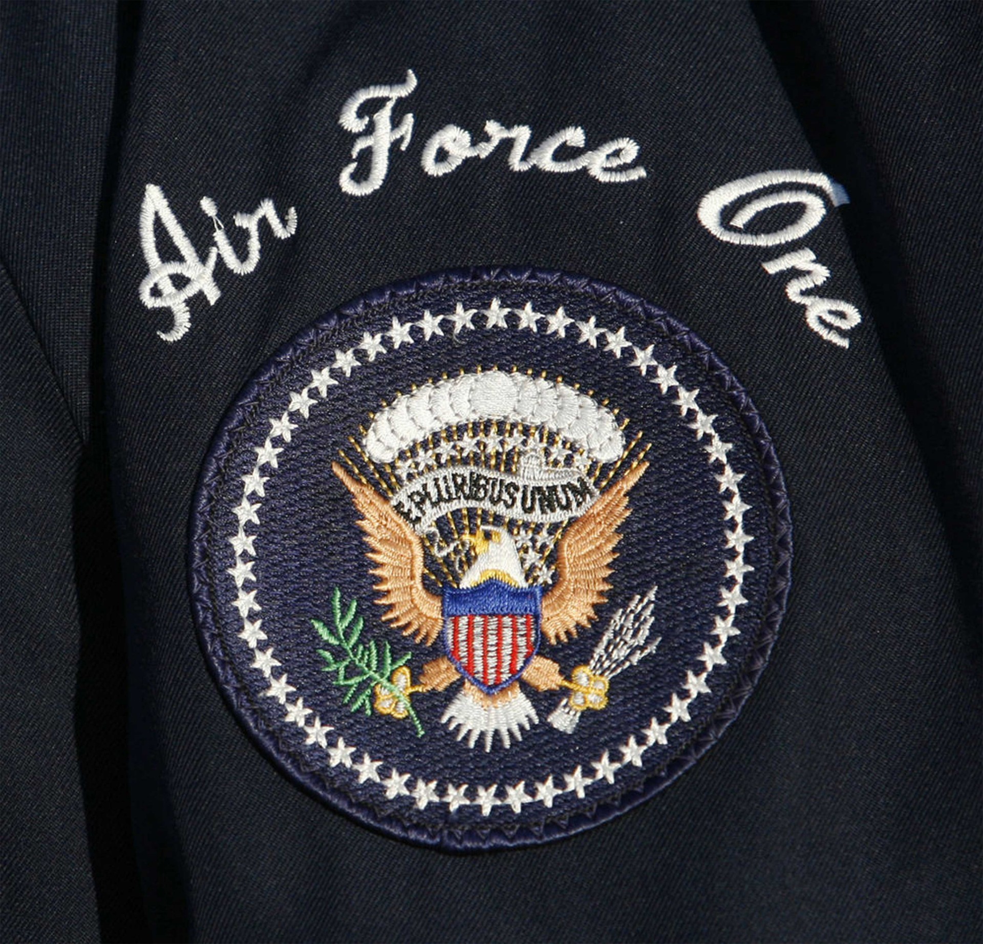
Hi Don. Thanks for clearing things up a bit. House of Cards used Adage Script. Perfect for me! But Adage Script and This AFO Font have different _A_ Is there any font that has that weird looking _A_? (Not Commercial Script _A_)

Note similar _A_ and _O_ in Two Color Brush Script embroidery font, not available as a computer digital font:
https://www.annthegran.com/prd/alphabets/embroidery-patterns/two-color-brush-script/1/mono1.aspx
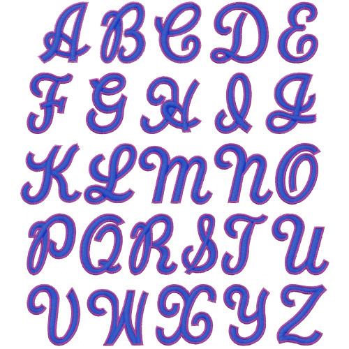
Found it here! Not sure if it has lower case letters? Othervise I's perfect!
Found it here! Not sure if it has lower case letters? Othervise I's perfect!
There is a lower case

You might prefer to use this lowercase, although the _z_ is awkward

And how can i download these fonts?
Well i can't. So if you find a text font that resembles Rochies you WILL get a REWARD. 


These are embroidery fonts, for use on an embroidery machine.
Embroidery fonts have very open counters and scripts are almost upright to enable the machine to produce a letter that is relatively legible.
If you compare the computer versions of some fonts that have been converted to embroidery fonts, the embroidery version is stiff and rather clunky.
Converting the embroidery fonts I mentioned to a versions usable on a computer is a DIY project that includes a lot of editing to deal with the stiff and clunky nature of the letter-forms.

Well... i decided to use Adage script. but it has a very different A than the embroidery font So it would be great if you could find a substitute for _A_
Slant it leftwards
Editado el 03/12/2016 a las 13:27 por donshottype
Fuente sugerida: Sterling Script
Editado el 03/12/2016 a las 13:27 por donshottype
Looks terrible! http://imgur.com/7pDDav6
Apply less leftwards slant, like so

Look at the House of Cards _A_ http://imgur.com/a/w3Bua
Somthing like that would be perfect.
Somthing like that would be perfect.
Another one!
http://i.imgur.com/LiJ9oaN.jpg
http://i.imgur.com/LiJ9oaN.jpg
Please Don!
Huso horario CEST. Ahora son las 21:58
